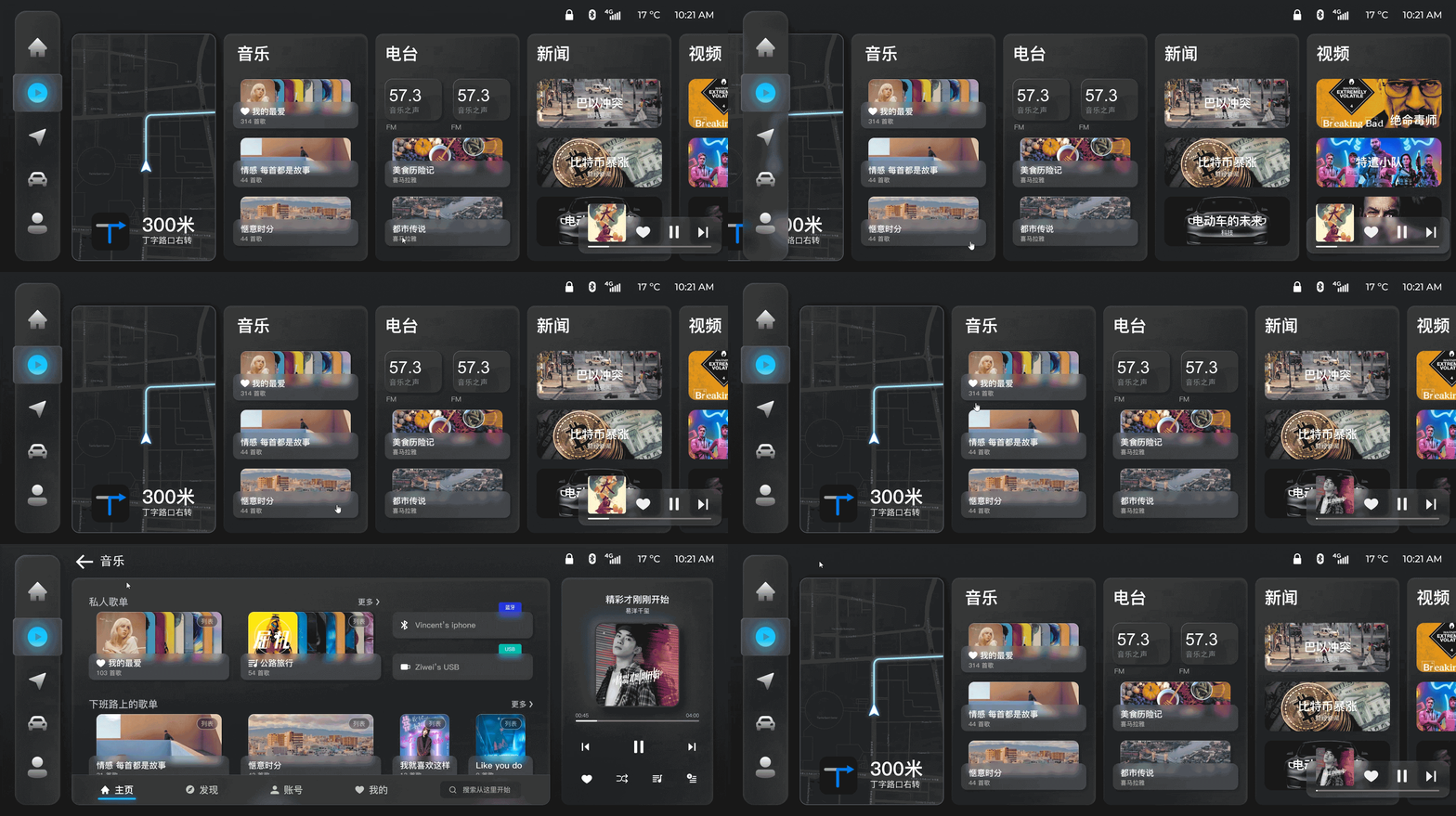
OUTCOMES


Usability test with 10 participants to went through the tasks of frequent-use functions
HongQi Music
Automotive entertainment music system that help drivers effortlessly find desired tunes with minimized distraction.
Timeline
3 Months
My Role
UI/UX Designer
Client
HongQi
Platform
Android Automotive OS
BACKGROUND
Hongqi needs a redesign of the music system to cater to a younger customer base.
The Hongqi automobile company is currently undergoing a strategic transformation, aiming to reach a younger customer base. However, the process has not been smooth, with many complaints received about the car's music system. Therefore, Hongqi hopes to redesign a new music entertainment system to better cater to its new target users.


Original Design
USER RESEARCH
Understanding users' habits and expectations help us identify the problem in original design
Based on the user interviews and survey we conducted, we had the following findings:
-
Drivers are the primary users
-
80% of the time users only use those frequently used features
-
The following 6 features are most frequently used: “liked songs” “personal lists” “recommend lists” “search” “bluetooth / USB” “recently played”

User Interviews

User Survey
USABILITY TEST


Usability test with 10 participants to went through the tasks of frequent-use functions
PROBLEMS
Frequent used features are hidden in deeper level.
According to the information architecture of original design, we noticed that most of the frequent used features are hidden in deeper level so that users usually need a long flow to finish their tasks. Such structure would cause users to have extra taps and operation time. And most importantly, it distracts too much driver’s attention from the road.
The GIF below shows users would need 4 taps to find one of the most frequently used feature “liked song”.

Original Layout and interface is chaotic and lack of affordance.
On the one hand, the initial design presents complexities in page layout, on the other hand elements of varying levels and types employ similar rectangular shapes. This inadvertently increases cognitive load, and requires users to invest more time to locate desired functions, potentially posing safety concerns for drivers in transit.

STRATEGY


Information Architecture
Flatten the structure and bring frequently use functions to upper level.


Page Layout
Keep layout simple and legible. Group related content together.
DESIGN
Entertainment Hub
Entertainment hub is the entrance to different entertainment media. On one hand, as the high level overall page, it should reveal the structure of entertainment hub so that users could better navigate through these sessions. On the other hand, some of the most used functions are preferred to be available here to reduce users operation time and continue user experience from phone.


Iteration 01
Flatten the information architecture by combining level 2 & level 3


Pros:
-
Flatter informtaion structure shorten user flow.
-
Showing the whole information structure make users aware of their current location and easy to nevigate.
Cons:
-
Buttons might be too small to tap when user driving.
-
Too much information in the same page make users do not know where to look at
-
No space for mini map
Iteration 02
Short cuts for recommendation content


Pros:
-
More organized layout
-
Mini map closer to driver
-
Recommendation card provides short cut to users’ frequently used features
Cons:
-
Contents on recommendation card come from multiple types of media, hard for user to tell the difference (User might want to listen to music, but tap on news contents by mistake)
Iteration 03 (Final Version)
Organized Card layout


Pros:
-
Simple and intuitive layout
-
Mini map closer to driver
-
Recommended contents are grouped by type of media
The final version's simple and self-explanatory layout make users fast navigate to the content they want. Short cut contents in the media card allow users achieve their goal without going into detail pages.

DESIGN
Music Hub
Problems in original design
-
It is the home page of music, frequently use function should be placed here.
-
The cards of different content types are using identical shapes, which increases users cognitive load.
-
The detail button leads users to another page. Such interaction might draw users’ extra attention when he is driving.


Different shapes
Different contents
Comparing to text, human’s eyes are more sensitive to figure. Using different shapes of card to represent play list, album and artist will reduce users’ cognitive load, and help them make decision in a shorter time.
Bring frequently used features to upper level.
In the first page of the music hub, the only frequent use function is the recommend list. However, we think it makes more sense to have the first page be a comprehensive and personalized home page with all the frequently used features driven by recommendation algo.

Before
-
Only two features are frequently used
-
Different contents are in the same shape

After
-
Prioritized user’s frequently used features
-
Intuitive content organization and shape


